The Blogger's Guide to Using Color Psychology in Graphics
When it comes to creating engaging graphics, understanding color psychology is key. You know colors play a significant role in conveying messages and eliciting responses from your audience.
But how exactly can you harness this power effectively in your designs? By exploring the nuances of color selection based on psychological principles, you can strategically influence how your content is perceived and make a lasting impact on viewers.

Key Takeaways
- Colors play a crucial role in conveying emotions and influencing behavior.
- Understanding color symbolism and cultural influences enhances message delivery.
- Visual hierarchy and brand personality are reflected through strategic color choices.
- Testing, analyzing, and measuring color impact are essential for effective design decisions.
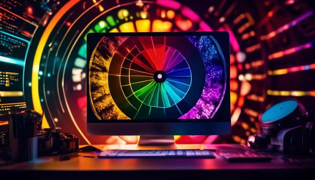
Understanding Color Psychology
To truly grasp the impact of color on human emotions and behavior, it's essential to delve into the realm of color psychology. Color theory plays a crucial role in understanding how different colors can evoke specific feelings and reactions in individuals. By tapping into this knowledge, you can effectively leverage colors in your marketing strategy to influence consumer behavior.

Color psychology isn't just a random assortment of hues; it's a strategic tool that can be used to convey messages, create brand identity, and influence purchasing decisions. For example, warm colors like red and orange are often associated with energy, passion, and excitement, making them ideal for grabbing attention and stimulating impulse purchases. On the other hand, cool colors like blue and green evoke feelings of calmness, trust, and serenity, which can be beneficial for promoting products or services that aim to provide a sense of security or reliability.
Understanding color psychology is fundamental to developing a successful marketing strategy that resonates with your target audience and drives the desired actions. By incorporating the right colors in your graphics and branding materials, you can establish a strong emotional connection with consumers and enhance the effectiveness of your messaging.
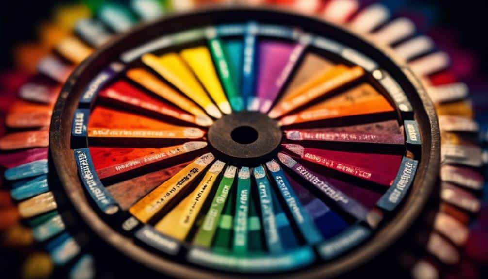
Choosing the Right Color Palette
When selecting a color palette for your graphics, consider the symbolism associated with different colors and their impact on emotions.
By understanding how colors can convey specific messages and evoke particular feelings, you can create designs that effectively communicate with your audience.
Choosing the right color combination isn't just about aesthetics but also about harnessing the power of colors to enhance the overall impact of your visual creations.
Color Symbolism in Design
Choosing the right color palette in design is crucial for evoking the desired emotions and responses from your audience. When considering color symbolism in your designs, remember to take into account:
- Cultural Influences
- Colors can have different meanings across cultures, so be mindful of the cultural context in which your design will be viewed.
- Understanding cultural symbolism can help you create designs that resonate with diverse audiences.
- Historical Context
- Certain colors may carry historical significance, evoking specific emotions or memories.
- Delving into the historical context of colors can add depth and richness to your design, making it more compelling and engaging for your audience.
Impact on Emotions
Considering the cultural influences and historical context of colors can significantly impact the emotions evoked by your chosen color palette in design. Different colors can elicit varied emotional responses due to their associations with specific feelings or concepts.
For example, warm colors like red and orange often evoke feelings of energy, passion, and excitement, while cool colors like blue and green may convey calmness, tranquility, and stability. Understanding how colors are perceived in different cultures can help you create designs that resonate with a broader audience.
Creating Visual Hierarchy
Wondering how to effectively establish visual hierarchy in your graphics to captivate your audience's attention instantly? When it comes to creating visual hierarchy, two key elements play a significant role: font pairing and contrast techniques.
Here's how you can make your graphics visually compelling:
- Font Pairing:
- Choose fonts that complement each other while also providing distinction. Pair a bold font with a more delicate one to create a visually appealing contrast that guides the viewer's eye through the content seamlessly.
- Contrast Techniques:
- Utilize contrast in font sizes, weights, colors, and styles to emphasize important information. By making headlines larger and bolder than body text, you can instantly draw attention to the main points of your graphics.
Conveying Brand Personality
To truly capture your audience's attention and solidify your brand's presence, infusing your graphics with the essence of your brand personality is key. Your brand identity is at the core of your business, representing who you are, what you stand for, and what sets you apart from the competition.
By using color psychology in your graphics, you can visually represent your brand values and create an emotional connection with your audience.
When conveying your brand personality through graphics, consider the emotions you want to evoke. Are you aiming for a sense of trustworthiness, excitement, sophistication, or friendliness? Choose colors that align with these emotions and reflect your brand's unique characteristics.
For example, a financial institution may opt for blues and greens to convey trust and stability, while a fashion brand might use bold and vibrant colors to showcase creativity and energy.
Evoking Emotions With Colors

Ready to tap into the power of color to evoke specific emotions in your audience?
Discover how different colors can influence mood, the deep-rooted symbolism behind each color, and the associations people typically make with certain hues.
Color and Mood
Color plays a significant role in evoking specific emotions in graphic design, influencing the way viewers perceive and interact with visual content. When considering color and mood in your designs, keep in mind the following:
- Color Trends:
- Stay updated on current color trends to ensure your graphics feel modern and relevant.
- Psychological Impact:
- Understand the psychological impact of colors; for example, blue can evoke feelings of calmness and trust, while red may convey energy and excitement.
Symbolism in Colors
Delve into the captivating world of graphic design where colors serve as powerful tools, evoking a myriad of emotions and meanings through symbolism. Colors carry cultural meanings and historical influences that can significantly impact how your audience interprets your graphics. Understanding the symbolism behind colors can help you create visuals that resonate deeply with viewers. Here's a table highlighting the symbolism of some common colors:
| Color | Cultural Meanings | Historical Influences |
|---|---|---|
| Red | Passion, Luck | Ancient China believed red brought good luck. |
| Blue | Trust, Calm | Blue was rare and expensive in Renaissance art. |
| Green | Growth, Nature | Associated with rebirth in ancient Egypt. |
Explore the rich tapestry of colors, and wield their symbolism to craft designs that speak volumes.
Color Associations
Embark on a journey through the realm of graphic design by understanding how color associations can evoke powerful emotions within your audience, building upon the symbolism explored in the previous section.
- Dive into the realm of cultural influences and how they shape color perception**:
- Uncover how different cultures interpret colors, influencing emotional responses in your audience.
- Harness the power of colors in marketing strategies to enhance visual appeal**:
- Learn how to strategically use colors to evoke specific emotions and drive desired actions from your audience.
Understanding color associations allows you to tap into a universal language that transcends words, enabling you to create visually compelling graphics that resonate deeply with your viewers. Explore the nuances of color psychology to elevate your designs and make a lasting impact.
Optimizing for Readability

To enhance the legibility of your graphics, consider adjusting the contrast between text and background colors. Improving contrast is crucial for making your text easy to read. Opt for light text on a dark background or vice versa to ensure readability. Bold fonts can also help enhance legibility, especially when paired with a contrasting background color.
Enhancing legibility isn't just about choosing the right colors but also about considering the font size. Make sure your text is large enough to be read comfortably, especially on smaller screens. Additionally, pay attention to line spacing to prevent text from appearing cramped or cluttered.
Testing and Analyzing Impact
When testing and analyzing the impact of your graphics, ensure that you gather data from diverse sources to obtain a comprehensive understanding of their effectiveness. Measuring effectiveness is crucial in determining how well your chosen colors resonate with your audience's color perception.
Here are some tips to help you with this process:
- Utilize A/B Testing: Conduct A/B tests with different color schemes to see which one yields better results. This method can provide valuable insights into what colors work best for your audience.
- *Quick Tip*: Use online tools like Google Optimize or Optimizely to easily set up A/B tests on your website.
- Collect Feedback: Gather feedback from your audience through surveys or focus groups to understand their reactions to the colors used in your graphics.
- *Quick Tip*: Offer incentives like discounts or freebies to encourage more people to participate in your feedback collection efforts.
Frequently Asked Questions
How Can Color Psychology Be Utilized in Graphic Design to Improve User Engagement and Interaction?
Want to boost user engagement in your design? By using color psychology, create color harmony to evoke specific emotional responses. Tailor your brand identity through a thoughtfully selected color palette that resonates with your audience.
Are There Any Cultural Considerations to Keep in Mind When Incorporating Color Psychology Into Graphics?
When incorporating color psychology into graphics, consider cultural influences and symbolic meanings to ensure your designs resonate globally. By acknowledging diversity and embracing different interpretations, you can create engaging visuals that speak to a wide audience.
Can Certain Color Combinations Have a Negative Impact on a Viewer's Perception of a Brand or Message?
When choosing color combos for your brand, remember that certain ones can impact how people view your message. Opt for color harmony to enhance brand perception. Avoid negative associations by being mindful of your color combinations.
How Can Color Psychology Be Used to Enhance Call-To-Action Buttons and Increase Conversion Rates?
Enhance your call-to-action buttons by leveraging color psychology. Create visual contrast for attention, evoke emotional responses for engagement. Ensure brand consistency and establish a clear visual hierarchy to guide users towards conversion. Experiment freely to find what works best.
Are There Any Tools or Resources Available to Help Analyze the Impact of Color Choices in Graphics?
Want to boost your design game? Color analysis tools like Adobe Color and Impact assessment resources such as Canva's Color Wheel can help you understand the impact of color choices in graphics. Give them a try!
Conclusion
Now that you've delved into the world of color psychology in graphics, you have the power to create visuals that truly resonate with your audience.
By understanding how colors evoke emotions, convey brand personality, and impact readability, you can strategically design graphics that leave a lasting impression.
Remember to test and analyze the impact of your color choices to ensure your graphics are effectively communicating your message.
Get ready to take your graphics to the next level with the power of color psychology!