
DIY Graphic Design: Tips and Tricks for Non-Designers
Creating stunning graphics that catch the eye and captivate your audience may seem like an insurmountable task if you're not a professional designer. However, fear not, as there are practical tips and tricks that can elevate your DIY graphic design game to new heights.
By mastering a few key principles and utilizing the right tools, you can unlock the potential to design visuals that truly stand out. Stay tuned to uncover the secrets that will help you transform your projects from mediocre to magnificent.

Key Takeaways
- Balance, contrast, and alignment are essential for visually appealing graphic designs.
- Understanding color psychology and consistency is crucial for effective design perception and brand recognition.
- Typography hierarchy, font pairing, and limited font usage contribute to clear and balanced communication.
- Utilizing white space creatively enhances visual appeal, guides focus, and establishes visual hierarchy.
Understanding Design Principles
To truly grasp the essence of graphic design, you must delve into the fundamental principles that underpin every creative endeavor. Two key principles that play a crucial role in design are balance and contrast. Balance ensures that elements are harmoniously arranged, creating a sense of equilibrium in your design. Contrast, on the other hand, adds visual interest by highlighting differences in elements like color, size, or shape.

Another vital aspect to consider is alignment. Proper alignment helps maintain a clean and organized layout, guiding the viewer's eyes smoothly across the design. Whether you choose to align elements to a grid or along a common edge, alignment contributes to the overall cohesiveness of your design.
Lastly, proximity is essential in design as it groups related elements together, establishing a visual relationship between them. By placing related elements close to each other, you can effectively communicate hierarchy and organization within your design. Understanding and applying these principles will elevate your design skills and help you create visually appealing and effective graphics.
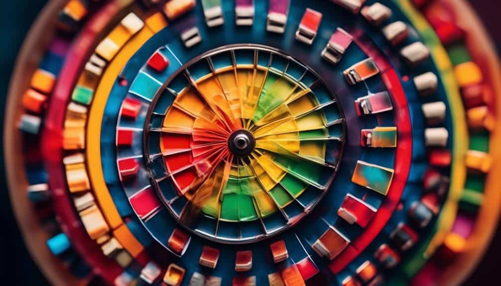
Choosing the Right Color Scheme
When selecting a color scheme for your graphic design project, consider the emotions and messages you want to convey through your visuals. Color psychology plays a significant role in how people perceive your design. Different colors evoke distinct feelings; for example, blue can convey trust and professionalism, while yellow exudes energy and optimism.
Branding is another crucial aspect to consider when choosing your color scheme. Your colors should align with your brand identity to create a cohesive and recognizable visual language. Consistency in color usage helps establish brand recognition and fosters a sense of reliability and trustworthiness with your audience.
Understanding color theory is essential for creating visual hierarchy in your design. By using contrasting colors for important elements and more subtle tones for supporting details, you can guide the viewer's eye and emphasize key points effectively. Remember, the colors you choose shouldn't only look aesthetically pleasing but also serve a purpose in conveying your intended message.
Typography Dos and Don'ts
Consider your typography choices just as carefully as you selected your color scheme to ensure your design effectively communicates your message. Typography plays a crucial role in how your audience perceives and interacts with your content. To create visually appealing and easy-to-read designs, it's important to understand typography hierarchy. This involves using different font sizes, weights, and styles to establish a clear order of importance within your text.
When it comes to font pairing techniques, aim to combine fonts that complement each other rather than clash. Pair a decorative headline font with a simple, easy-to-read body font for balance. Avoid using too many different fonts in one design as it can create a chaotic and unprofessional look. Stick to a maximum of two or three fonts to maintain consistency and cohesion throughout your project.
Utilizing White Space Effectively
Maximize the impact of your design by strategically incorporating white space to enhance visual appeal and guide viewer focus. White space balance is crucial in creating a harmonious layout that allows elements to breathe and stand out. Think of white space as the silence between musical notes – it gives your design room to speak and be heard. By embracing white space, you can direct the viewer's eye towards key elements, creating a visual hierarchy that guides them through the design.
Visual impact is greatly influenced by how you utilize white space. Too little white space can make a design feel cluttered and overwhelming, while too much might leave it feeling empty and lacking focus. Finding the right balance is key to creating a visually engaging composition that captures attention and communicates effectively. Experiment with different amounts of white space to see how it affects the overall look and feel of your design.
Tools and Resources for Non-Designers

Discover essential tools and valuable resources that can empower you, as a non-designer, to create visually stunning designs effortlessly. Design software like Canva or Adobe Spark offers user-friendly interfaces and pre-made templates that simplify the design process. These tools provide a wide range of customization options, from selecting fonts to choosing color schemes, making it easy for you to bring your creative vision to life.
Online tutorials are another fantastic resource for honing your design skills. Platforms like YouTube and Skillshare offer a plethora of tutorials on graphic design principles, software tips, and design inspiration. By following step-by-step guides and watching expert demonstrations, you can quickly learn new techniques and enhance your design proficiency.
With the right design software and access to online tutorials, you have everything you need to start creating professional-looking designs. Embrace these tools and resources to unleash your creativity and develop your graphic design abilities without feeling overwhelmed. Whether you're designing a social media post or a flyer for an event, these resources will support you every step of the way.
Frequently Asked Questions
Can I Use Copyrighted Images in My DIY Graphic Design Projects?
Yes, you can use copyrighted images in your DIY graphic design projects under fair use, but be cautious of legal considerations. Ensure your usage complies with regulations to avoid issues in your creative endeavors.
How Can I Ensure My DIY Designs Are Accessible to Individuals With Disabilities?
To ensure your DIY designs are accessible, consider color contrast for readability. Add alt text to describe images for the visually impaired. By incorporating these elements, you make your creations inclusive and enjoyable for all.
What Are Some Common Mistakes to Avoid When Designing Graphics for Social Media?
When designing for social media, avoid common mistakes. Use color theory to capture attention and convey emotions effectively. Choose fonts wisely for readability and brand consistency. Keep it engaging and accessible for all.
How Can I Effectively Balance Text and Images in My Designs?
When balancing text and images, remember color theory. Choose fonts wisely for maximum impact. Keep it simple but bold. Let your creativity flow; there are no strict rules. Experiment, have fun, and find your unique style.
Are There Any Tips for Creating Cohesive Branding Across Multiple Graphic Design Projects?
To create cohesive branding across projects, stick to consistent color palettes for unity. Tailor typography choices to match your brand's personality. Blend these elements creatively for a memorable and recognizable brand identity that stands out.
Conclusion
You've now armed yourself with the basic tools to tackle DIY graphic design like a pro. Remember to keep design principles in mind, choose colors wisely, play with typography, and make use of white space.
And don't forget to explore the plethora of tools and resources available to help you along the way. With practice and determination, you'll soon be creating eye-catching designs that rival those of professional designers.
Happy designing!