Infographic Design 101: A Blogger’s Guide to Visual Data Communication
Imagine you're driving on a long road trip and suddenly encounter a sign with complex directions that are unclear at first glance. Just like that sign, when it comes to creating infographics, the way you present data can either guide your audience smoothly towards understanding or leave them feeling lost in a sea of information.
Understanding the principles of infographic design is like being equipped with a reliable GPS system that ensures your visual communication hits the mark every time.

As a blogger looking to enhance the impact of your content, mastering the art of infographics is key to engaging your readers and standing out in a crowded digital landscape.
Key Takeaways
- Infographics simplify complex information visually, making them effective for communicating data in a fast-paced world.
- Careful data selection and curation are crucial for creating engaging and clear messages that resonate with the audience.
- Design elements such as color psychology, typography, and strategic color choices play a significant role in enhancing the visual appeal and message communication of infographics.
- Utilizing popular design principles and tools like consistent alignment, whitespace, and various data visualization techniques, along with promoting infographics through social media, influencers, and SEO optimization, can maximize their impact and reach.

Importance of Infographics

Discover why infographics are essential tools for conveying complex information in a visually appealing and easily digestible format. In today's fast-paced world, visual storytelling has become increasingly popular as people crave instant, engaging content. Infographics play a vital role in this trend by transforming data into captivating visuals that are both informative and aesthetically pleasing.
Data visualization trends show that infographics are more likely to grab your audience's attention compared to plain text or standard graphs. By combining images, charts, and text, infographics provide a holistic view of the information, making it easier for readers to grasp complex concepts quickly. Visual storytelling through infographics allows you to convey a compelling narrative, guiding your audience through the data in a logical and structured manner.
In a world inundated with information, infographics stand out as powerful tools for simplifying data and enhancing understanding. Embrace the data visualization trends and harness the potential of infographics to captivate your audience with visually engaging content.
Selecting Relevant Data
When creating an infographic, selecting relevant data is crucial for conveying your message effectively. By following specific data relevance criteria and a structured information selection process, you can ensure that your infographic is informative and engaging.
Make sure to choose data points that directly support your main idea and help your audience understand the information you're presenting.
Data Relevance Criteria
To ensure your infographic effectively communicates its message, carefully selecting relevant data is crucial. When choosing data for your infographic, consider its accuracy and how well it fits into your visual storytelling. Here's a helpful guide to assist you in determining the relevance of your data:
| Criteria | Description |
|---|---|
| Data Accuracy | Ensure the information is reliable and precise. |
| Visual Storytelling | Check if the data enhances the narrative flow. |
Information Selection Process
For effective infographic design, the process of selecting relevant data plays a crucial role in conveying your message clearly and engagingly. Data curation is the art of carefully choosing and organizing information to highlight key points effectively.
When selecting data for your infographic, consider what'll resonate with your audience and support your overall message. Think about how each piece of information contributes to the narrative you want to tell through visual storytelling.
Choosing Design Elements
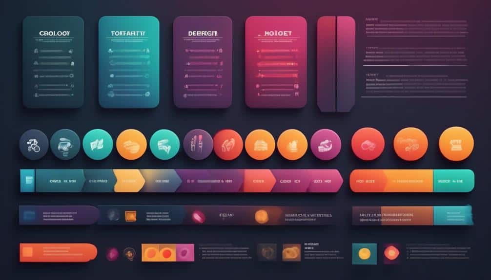
When creating an infographic, the design elements you choose can greatly impact its effectiveness. Factors like color psychology and typography selection play a crucial role in conveying your message clearly and engaging your audience.
Color Psychology
How can color psychology influence the design elements you choose for your infographics?
Color symbolism plays a crucial role in conveying messages and evoking emotional responses in your audience. Different colors can trigger specific feelings or associations, impacting the visual impact of your infographic.
Understanding color psychology can help you establish a strong brand identity and create a cohesive visual narrative. By strategically selecting colors based on their psychological effects, you can enhance the overall design of your infographics and effectively communicate your message.
Whether you aim to convey trustworthiness with blue hues or energy with vibrant reds, the colors you choose play a significant role in shaping the viewer's perception and engagement with your content.
Typography Selection
Selecting the right typography is key to creating visually appealing and engaging infographics that effectively convey your message to your audience. Typography trends are constantly evolving, so it's essential to stay updated on what's current. When choosing font pairings for your infographic, consider combining a bold, attention-grabbing headline font with a simpler, easy-to-read body font for contrast. Here's a helpful table to guide you through some popular font pairings:
| Headline Font | Body Font |
|---|---|
| Montserrat | Open Sans |
| Playfair Display | Lato |
| Lora | Roboto |
| Raleway | Merriweather |
Color Theory Basics
Understanding the fundamentals of color theory is essential for creating visually appealing and cohesive infographics. When it comes to color theory basics, there are a few key concepts to keep in mind:
- Color Harmony: Incorporating colors that work well together can significantly enhance the overall look of your infographic. Consider using color schemes like complementary, analogous, or triadic to create a harmonious visual experience for your audience.
- Visual Impact: Colors have the power to evoke emotions and convey messages without words. Choose colors that align with the tone and message of your infographic to make a strong visual impact on your viewers.
- Contrast: Utilizing contrast between light and dark colors, or between warm and cool tones, can help important information stand out and improve readability.
- Consistency: Maintaining consistency in your color choices throughout the infographic helps create a sense of unity and professionalism, tying the design elements together seamlessly.
Typography Tips

When designing infographics, paying attention to typography can greatly enhance the overall visual appeal and readability of your content. Font pairing plays a crucial role in creating a harmonious and engaging design. Choose fonts that complement each other while also providing enough contrast to distinguish between different types of information. For example, pairing a bold, attention-grabbing font with a simpler, more readable one can help guide your audience through the infographic seamlessly.
Text hierarchy is another essential aspect to consider. By using varying font sizes, weights, and styles, you can establish a clear hierarchy that guides readers through the information in a structured way. Important headings should stand out with larger or bolder fonts, while body text can be more understated for easy reading. Additionally, utilizing different colors for text can further emphasize the hierarchy and make key points more noticeable.
Layout and Composition
To enhance the visual appeal and readability of your infographics further, consider how the layout and composition can elevate the overall design. When arranging your infographic elements, keep these tips in mind:
- Visual Hierarchy: Establish a clear hierarchy in your design by emphasizing key information through size, color, and placement. Guide your audience on where to look first and how to navigate the content seamlessly.
- Image Placement: Strategically place images throughout your infographic to complement and enhance the text. Images can help break up long blocks of text, provide visual interest, and reinforce your message effectively.
- Consistent Alignment: Maintain a consistent alignment throughout your design to create a cohesive look. Whether you choose center, left, or right alignment, stick to it to avoid visual clutter and confusion.
- Whitespace Utilization: Don't underestimate the power of whitespace. Allow enough space between elements to improve readability and give your design a clean and polished appearance. Whitespace can also help direct the viewer's focus where you want it most.
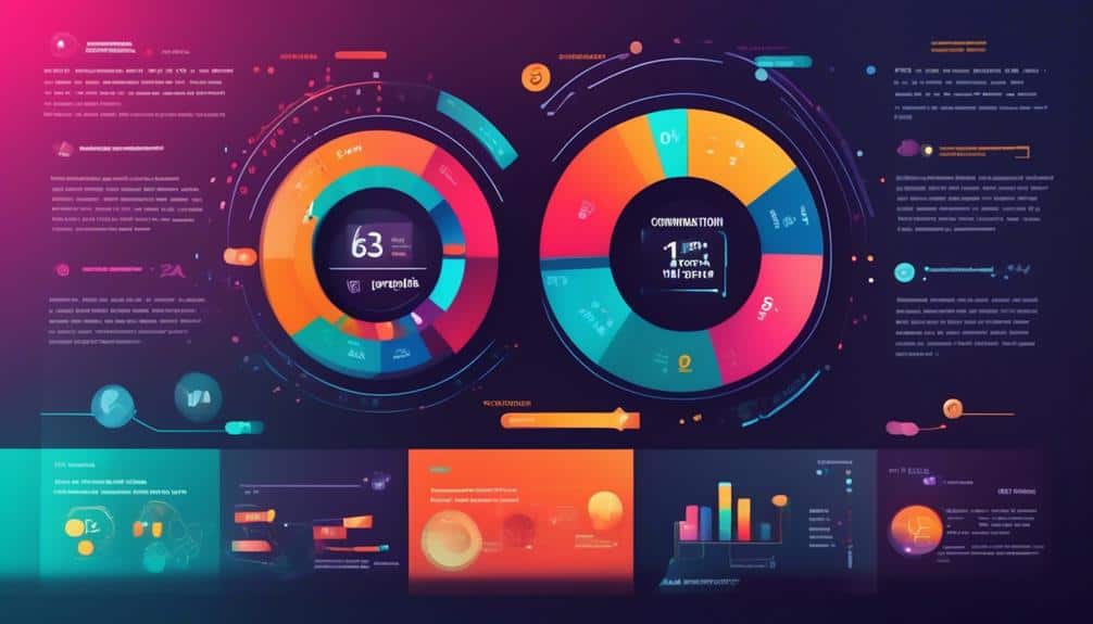
Data Visualization Techniques

For effective data visualization in your infographics, utilize various techniques to present complex information in a visually engaging and understandable manner. When crafting your infographics, consider these data visualization tips to create compelling visuals that resonate with your audience. Incorporate elements like charts, graphs, and maps to illustrate key data points clearly. Choose colors thoughtfully to evoke the right emotions and ensure readability. Utilize icons and illustrations to add context and make information more digestible.
Stay updated on infographic trends to keep your designs modern and impactful. Experiment with interactive features that allow users to engage with your data dynamically. Embrace storytelling by structuring your information in a narrative format that guides the viewer through a logical flow of data. Remember, simplicity is key – avoid cluttering your infographic with excessive information.
Tools for Creating Infographics
Explore a variety of user-friendly online platforms and software tools to effortlessly craft visually captivating infographics that effectively convey your message. When choosing infographic software, consider these options:
- Canva: A popular choice for beginners and professionals alike, Canva offers a wide range of templates, graphics, and tools to design stunning infographics with ease.
- Piktochart: With its drag-and-drop interface and customizable themes, Piktochart simplifies the infographic creation process, allowing you to focus on content rather than technicalities.
- Visme: Known for its interactive features and animation capabilities, Visme is ideal for creating engaging infographics that stand out in a crowded digital space.
- Adobe Illustrator: For advanced users looking for more design flexibility, Adobe Illustrator provides extensive tools for creating intricate and customized infographics tailored to specific design trends.
Experiment with these tools to find the one that best suits your infographic design needs and aligns with current design trends. Let your creativity flow as you bring your data to life through visually appealing infographics.
Sharing and Promoting Infographics

Consider utilizing various digital platforms and strategies to effectively share and promote your visually compelling infographics. When it comes to infographic promotion, social media platforms are powerful tools to reach a broad audience. Engage with your followers on platforms like Instagram, Twitter, and LinkedIn to showcase your infographics and encourage sharing. Additionally, consider reaching out to influencers or bloggers in your niche to help amplify your infographics through their networks. Collaborating with others can significantly expand your infographic's reach.
Here are some effective infographic sharing and outreach strategies to consider:
| Infographic Sharing | Outreach Strategies |
|---|---|
| Post on social media | Collaborate with influencers |
| Share in newsletters | Guest post on relevant blogs |
| Submit to infographic directories | Engage with industry communities |
Infographic SEO Best Practices
To further enhance the visibility and reach of your visually captivating infographics, optimizing them for search engines through Infographic SEO Best Practices is essential. When diving into the world of Infographic marketing and visual storytelling, here are four key strategies to boost your infographic's SEO performance:
- Keyword Research: Conduct thorough keyword research to understand what terms your audience is searching for. Integrate these keywords strategically into your infographic's title, description, and alt text.
- Image Optimization: Compress your infographic file size without compromising quality to improve loading speed. Use descriptive filenames and include relevant keywords in the image file.
- Backlink Building: Encourage other websites to link back to your infographic, boosting its credibility and search engine ranking. Share your infographics on social media platforms, blogs, and industry websites.
- Mobile-Friendly Design: Ensure your infographic is responsive and visually appealing on mobile devices. Google prioritizes mobile-friendly content, so optimizing for mobile can improve your SEO performance.
Frequently Asked Questions
How Can Infographics Be Used to Engage With Different Target Audiences Effectively?
To engage effectively with diverse audiences, use infographics for visual storytelling. Tailor content to resonate with different groups. Make data visually appealing and easy to grasp. Spark curiosity, drive engagement, and convey information efficiently.
What Are Some Common Mistakes to Avoid When Selecting Data for an Infographic?
When choosing data for an infographic, common pitfalls include using too much information, neglecting to fact-check, relying on outdated stats, not considering your target audience, and failing to tie data to engaging strategies.
How Can One Ensure the Accessibility and Inclusivity of Their Infographic Design?
Ensure your infographic design is accessible by using alt text for images, considering color contrast for readability, and providing text versions for screen readers. Foster inclusive communication by using simple language and diverse visuals.
Are There Any Specific Trends in Infographic Design That Bloggers Should Be Aware Of?
Looking at current trends in infographic design can boost your blog's visual appeal. Incorporate color psychology for impact, follow typography trends for a modern touch. Utilize visual hierarchy and data visualization techniques to make information easily digestible.
How Can Infographics Be Integrated Into a Larger Content Marketing Strategy for Maximum Impact?
To integrate infographics into your content marketing strategy for max impact, consider using them as visual storytelling tools. Engage your audience with eye-catching graphics that convey key messages. Incorporate infographics strategically for effective integration and heightened audience engagement.
Conclusion
So there you have it – infographics are a powerful tool for bloggers to communicate data in a visually appealing way.
By selecting relevant data, choosing the right design elements, and following color theory and typography tips, you can create effective infographics that engage your audience.
Utilize data visualization techniques and tools to bring your infographics to life, and don't forget to share and promote them for maximum impact.
Keep these infographic SEO best practices in mind for optimal results.
Happy designing!