DIY Design: Simplifying Visual Content Creation for the Non-Designer
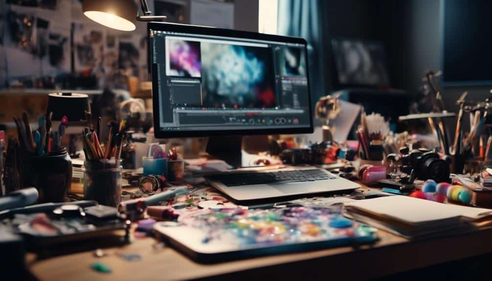
When it comes to visual content creation, diving into the realm of design can often feel like navigating uncharted waters. Yet, fear not as there are ways to chart a course that simplifies this seemingly complex terrain.
By understanding the fundamental principles of visual design and employing user-friendly tools at your disposal, you can unlock the potential to create engaging and professional-looking visuals without the need for a designer's expertise.

So, how can you transform your visual content with ease and confidence?
Key Takeaways
- Prioritize simplicity and fundamental visual design principles for effective DIY design.
- Trust your instincts when choosing color palettes and experiment with combinations for harmony.
- Utilize basic shapes creatively with color and negative space for impactful graphic elements.
- Master font pairing and hierarchy to establish a visually appealing and readable text design.

Understanding Visual Design Basics
To create visually engaging content as a non-designer, grasp the fundamental principles of visual design basics. Understanding visual composition techniques and graphic design principles is key to crafting compelling visuals.
Start by learning about the rule of thirds, balance, and hierarchy to create visually harmonious designs. Incorporate elements of visual storytelling such as color, typography, and imagery to convey your message effectively.
Effective image selection plays a crucial role in capturing the audience's attention and communicating your narrative. Experiment with different layouts, fonts, and colors to see what resonates best with your content. Remember, simplicity is often more impactful than complexity.
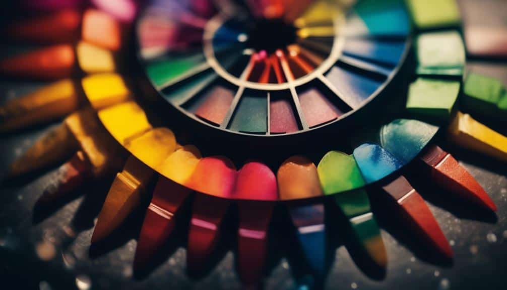
Choosing the Right Color Palette
Selecting the perfect color palette is a crucial step in creating visually captivating content that resonates with your audience. Understanding color psychology and harmony can help you evoke the right emotions and make a lasting impact. When choosing colors, consider the trends but don't be afraid to experiment and push boundaries. Here's a guide to help you navigate the world of color palettes:
| Warm Colors | Cool Colors |
|---|---|
| Red | Blue |
| Orange | Green |
| Yellow | Purple |
Warm colors like red and orange can convey energy and passion, while cool colors like blue and green often evoke calmness and trust. Experiment with different combinations to find what suits your content best. Remember, harmony is key to creating a cohesive and visually appealing design. Stay open to new ideas and trends, but trust your instincts when it comes to selecting the right color palette for your visual content.
Utilizing Simple Graphic Elements

Ready to take your visual content to the next level?
Embrace the power of basic shapes for impactful designs and infuse color for visual appeal.
Simple graphic elements can make a world of difference in capturing attention and conveying your message effectively.
Basic Shapes for Impact
With strategic placement of basic shapes, you can instantly enhance the visual impact of your content.
- Shape Manipulation:
- Experiment with resizing, rotating, and overlapping basic shapes to create unique and eye-catching visuals.
- Combine circles, squares, and triangles in unexpected ways to add depth and intrigue to your designs.
- Use negative space to highlight shapes and draw attention to key elements.
- Design Impact:
- Harness the power of simplicity by incorporating basic shapes to convey complex ideas in a clear and straightforward manner.
- Embrace minimalism to achieve a modern and sophisticated look.
- Balance intricate details with the simplicity of basic shapes for a harmonious design that captivates your audience.
Color for Visual Appeal
To enhance the visual appeal of your content, infuse simple graphic elements with vibrant colors that evoke emotion and captivate your audience instantly.
Color psychology plays a significant role in branding and visual storytelling, as different colors can evoke specific emotions and associations.
When choosing colors for your designs, consider the emotions you want to convey and align them with your brand's identity. Warm colors like red and orange can create a sense of excitement and energy, while cool colors like blue and green evoke calmness and trust.
Experiment with various color combinations to find the perfect mix that resonates with your audience and enhances the overall impact of your visual content.
Incorporating Engaging Typography
Ready to elevate your visual content with captivating typography?
Discover the art of font pairing to create harmonious text combinations that draw in your audience.
Learn how to master text hierarchy to effectively convey your message and make your content visually engaging.
Font Pairing Tips
Explore how combining different fonts can elevate the visual appeal of your content and create a lasting impact on your audience.
When it comes to font pairing, keep in mind the following tips:
- Font Style:
- Mix a decorative font with a simple, easy-to-read one for contrast.
- Font Size:
- Use varying sizes to establish a visual hierarchy; larger fonts for headings and smaller for body text.
- Consistency:
- Stick to 2-3 fonts maximum to maintain a cohesive look throughout your design.
Text Hierarchy Importance
Text Hierarchy Importance
Elevating your visual content through font pairing is just the beginning; now, let's dive into the crucial role of text hierarchy in creating engaging typography that captivates your audience. When it comes to font selection, prioritize readability to ensure your message is easily absorbed. Establishing a strong visual hierarchy within your text helps guide the viewer through the content with balance. To achieve this, consider the following:
| Title | Subtitle | Body Text |
|---|---|---|
| Serif Font | Sans-serif Font | Italics |
| Larger Size | Medium Size | Smaller Size |
| Bold Weight | Regular Weight | Light Weight |
Exploring User-Friendly Design Tools

Wondering how you can effortlessly create visually engaging content without the need for advanced design skills? Dive into the world of user-friendly design tools that cater to your creative needs. Here's a breakdown to help you navigate through the options:
- Design Tool Comparison
- Explore various design tools to find one that aligns with your vision and style.
- Look for intuitive interfaces that make the design process seamless and enjoyable.
- Consider features like templates, drag-and-drop functionality, and customizable elements for easy customization.
With so many design software alternatives available, you have a plethora of beginner-friendly options to choose from. Embrace the freedom to experiment, learn, and craft stunning visuals with tools that support your creativity. Don't let a lack of design experience hold you back – these user-friendly design tools are here to empower you on your creative journey.
Tips for Consistent Branding
As you harness the power of user-friendly design tools to craft visually engaging content, ensuring consistent branding across your creations becomes key to establishing a strong and recognizable identity. Consistency in branding not only helps in building trust with your audience but also reinforces your brand's values and message. To maintain this consistency, consider the following branding strategies and design consistency tips:
| Branding Strategies | Branding Elements | Visual Identity |
|---|---|---|
| Define your brand voice | Logo | Color Palette |
| Create brand guidelines | Typography | Image Style |
| Use consistent messaging | Brand imagery | Design Layout |
Frequently Asked Questions
How Can Non-Designers Effectively Balance Text and Images in Their Visual Content?
To effectively balance text and images in your visual content, focus on color contrast, font pairing, image placement, and whitespace ratio. Experiment, trust your instincts, and remember that simplicity often speaks volumes.
What Are Some Common Mistakes to Avoid When Creating Visual Content as a Non-Designer?
When creating visual content as a non-designer, avoid common mistakes like neglecting color theory and font pairing. Focus on visual hierarchy and brand consistency to make your designs stand out and communicate effectively.
Are There Any Specific Design Trends That Non-Designers Should Be Aware of When Creating Visual Content?
When creating visual content, keep in mind color psychology and typography. Stay on-trend with minimalist design and infographic tips. By being aware of these elements, your creations will be more engaging and visually appealing.
How Can Non-Designers Ensure Their Visual Content Is Accessible to All Audiences, Including Those With Disabilities?
To ensure your visual content reaches all, focus on color contrast and font choice. Describe images with alt text for screen readers. Make your content inclusive and accessible to everyone, including those with disabilities.
What Are Some Advanced Design Techniques That Non-Designers Can Learn to Enhance Their Visual Content Creation Skills?
To enhance your visual content creation skills, delve into color theory and typography for impactful designs. Experiment with grid layout and negative space for balance. With practice and curiosity, you'll transform your creations into stunning visuals.
Conclusion
You've learned the basics of DIY design, from color palettes to typography. By incorporating simple graphics and user-friendly tools, you can create visually appealing content even as a non-designer.
Remember to stay consistent with your branding for a polished look. With these tips in mind, you're ready to tackle any design project with confidence.
Start creating and unleash your creativity today!