Revolutionize Your Email Engagement With Advanced Mobile Design Tips
Did you know that 81% of people check their emails on their smartphones? With the majority of email recipients accessing their messages on mobile devices, it has become crucial for businesses to optimize their email designs for a seamless mobile experience.
But how can you truly revolutionize your email engagement? In this discussion, we will explore advanced mobile design tips that will captivate your audience, boost click-through rates, and ultimately drive conversions.

From responsive email design best practices to effective use of visuals and graphics, we will delve into the strategies that will take your email engagement to the next level.
So, let's dive in and discover the secrets to revolutionizing your email engagement through advanced mobile design techniques.

Key Takeaways
- Mobile optimization is crucial for maximizing email engagement on smartphones.
- Responsive email design ensures that emails adapt and display properly on different devices.
- Streamlining email content for mobile by customizing templates, using concise subject lines, and incorporating mobile-friendly buttons and clear CTAs.
- Effective use of visuals and graphics improves engagement and makes emails memorable, so it's important to optimize visuals for mobile devices and use high-quality graphics relevant to the content and message.
Importance of Mobile Optimization

Mobile optimization is crucial for maximizing email engagement on smartphones and ensuring an enjoyable user experience. As mobile design trends continue to evolve, it's essential to adapt your email campaigns accordingly. With more people accessing emails on their smartphones, it's important to create a seamless and responsive mobile user experience.
By optimizing your emails for mobile devices, you're catering to the needs of your audience who are constantly on the go. Mobile optimization ensures that your emails are visually appealing, easy to read, and navigate on smaller screens. It also ensures that your content is accessible and engaging, regardless of the device your audience is using.
Mobile design trends are constantly changing, and it's important to stay up-to-date with the latest advancements. Incorporating responsive design elements, such as fluid layouts and scalable images, can help your emails adapt to different screen sizes and resolutions. Additionally, using large fonts, clear call-to-action buttons, and simplified layouts can enhance the mobile user experience and encourage higher engagement rates.
Responsive Email Design Best Practices
When it comes to email design, it's crucial to consider the small screens of mobile devices.
Designing your emails to be responsive ensures that they'll adapt and display properly on different devices, providing a seamless experience for your recipients.
Designing for Small Screens
To optimize email engagement on small screens, consider implementing responsive design best practices. When designing for small screens, it's crucial to prioritize the mobile user experience.
Start by keeping your email design simple and clutter-free. Use a single column layout to ensure that your content is easy to read and navigate. Avoid using small fonts or excessive text, as it can be difficult for users to read on smaller screens.
Optimize your images for mobile devices by compressing them and using the correct file formats. Additionally, make sure your call-to-action buttons are large and easily clickable.
Remember to test your emails on various mobile devices to ensure that they're visually appealing and function properly. By following these small screen design tips, you can enhance the mobile user experience and increase email engagement.
Optimizing for Different Devices
Consider implementing responsive email design best practices to optimize for different devices.
With the increasing use of smartphones, tablets, and laptops, it's crucial to ensure that your emails are easily accessible and visually appealing across different screen sizes. By optimizing your email design for various devices, you can enhance the user experience and increase engagement with your audience.
Responsive email design allows your emails to adapt seamlessly to different screen sizes, ensuring that your message is delivered effectively. It eliminates the need for users to zoom in or scroll horizontally, providing a more convenient and enjoyable experience.
Streamlining Email Content for Mobile
Make your email content more streamlined for mobile users with these advanced design tips.
Customizing templates and incorporating interactive elements are key strategies to engage your audience effectively on mobile devices.
When customizing templates, consider the limited screen space on mobile devices and create responsive designs that adapt to different screen sizes. Use a single column layout to ensure easy readability and avoid overcrowding the email with excessive content.
Keep your subject line concise and compelling to grab the attention of busy mobile users.
Incorporating interactive elements can enhance the mobile experience and encourage user engagement. Consider using mobile-friendly buttons and clear call-to-action (CTA) buttons that are easily clickable on touch screens. Add interactive features like image carousels or animated GIFs to make your emails visually appealing and engaging.
To streamline your email content, prioritize the most important information and keep it concise. Use short paragraphs and bullet points to make your content scannable and easy to digest. Avoid large blocks of text that can be overwhelming on small screens.
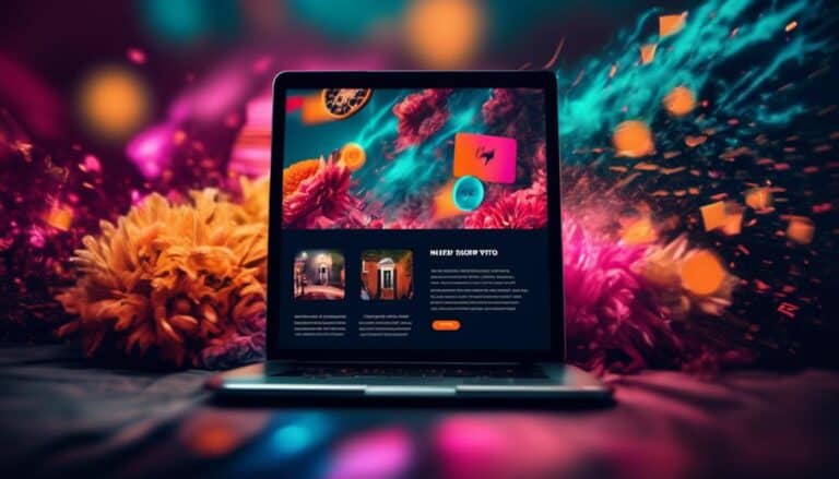
Effective Use of Visuals and Graphics
Are you looking to enhance the visual appeal of your email campaigns?
The effective use of visuals and graphics can significantly improve engagement and make your emails more memorable.
Enhancing Email Visuals
To captivate your audience and make your emails stand out, leverage the power of visuals and graphics effectively. Incorporating visually appealing elements into your email design is crucial in today's fast-paced digital world. Email design trends show that mobile user experience is a top priority. Therefore, it's essential to optimize your visuals for mobile devices.
Ensure that your images are responsive and load quickly on smartphones and tablets. Use high-quality graphics that are relevant to your content and enhance the overall message you want to convey. Additionally, consider using animations or GIFs to add interactive elements and capture your readers' attention.
Graphic Design Techniques
Incorporating visually compelling elements into your email design is essential for captivating your audience and setting your emails apart from the competition.
To achieve this, it's important to understand and apply graphic design principles that align with current mobile design trends.
First, focus on simplicity and minimalism. Mobile screens are smaller, so cluttered designs can be overwhelming and difficult to navigate. Use clean lines, ample white space, and bold typography to create a visually pleasing layout.
Second, leverage the power of color. Choose a color palette that reflects your brand and evokes the desired emotions in your audience. Vibrant colors can grab attention, while muted tones can create a sense of sophistication.
Lastly, consider the use of images and graphics. High-quality visuals can enhance the overall aesthetic of your emails and make them more engaging. Whether it's product images, illustrations, or infographics, ensure they're optimized for mobile devices and load quickly.
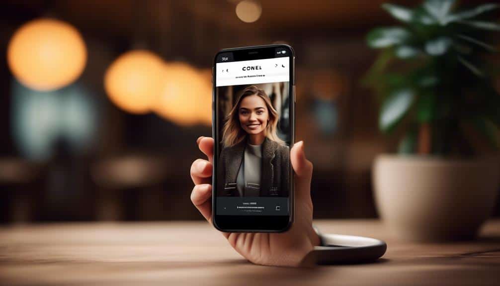
Mobile-Friendly Visual Content
Maximize engagement with your mobile emails by effectively utilizing visuals and graphics that are optimized for mobile devices. Mobile-friendly image formatting is crucial to ensure that your images load quickly and display correctly on smaller screens. Use image compression techniques to reduce file sizes without compromising quality. Additionally, consider using responsive design to adapt your visuals to different screen sizes, ensuring a seamless viewing experience.
Incorporating mobile-friendly video content is another effective way to engage your audience. Embed videos directly into your emails or provide a link to a mobile-friendly landing page where the video can be viewed. Keep videos short and impactful to capture attention and maintain interest.
Optimizing Call-to-Action Buttons
For enhanced email engagement, make your call-to-action buttons optimized by implementing these advanced mobile design tips. Designing layouts that are visually appealing and easy to navigate is crucial for increasing conversions. When it comes to your call-to-action buttons, there are a few key factors to consider.
First, ensure that your buttons are easily clickable on mobile devices. Make them large enough to be tapped with a finger, and provide enough space around them to avoid accidental clicks. Additionally, use contrasting colors for your buttons to make them stand out and catch the reader's attention.
Next, be clear and concise with your button text. Use action-oriented words that motivate the reader to take the desired action. For example, instead of using generic phrases like 'Click here' or 'Learn more,' be specific and use phrases like 'Get my free ebook' or 'Start my trial now.'
Utilizing Mobile-Friendly Fonts and Typography

To continue optimizing your email engagement, let's now explore the importance of using mobile-friendly fonts and typography. In today's mobile-centric world, it's crucial to ensure that your email messages aren't only visually appealing but also easy to read on various devices.
Here are three reasons why utilizing mobile-friendly fonts and typography is essential:
- Improved readability: Mobile-friendly fonts are designed specifically for smaller screens, ensuring that your recipients can read your email effortlessly. By selecting fonts that are clear and legible, you enhance the overall readability of your message, making it easier for your audience to consume your content.
- Consistent brand experience: Your choice of fonts and typography plays a significant role in maintaining a consistent brand experience across different touchpoints. By using fonts that align with your brand guidelines, you create a cohesive visual identity that resonates with your recipients, fostering brand recognition and trust.
- Enhanced responsiveness: Mobile-friendly fonts are an integral part of responsive email templates. These templates automatically adjust the font size and spacing based on the device's screen size, ensuring that your emails look great on any device, be it a smartphone, tablet, or desktop. By utilizing responsive email templates, you provide a seamless viewing experience for your recipients, regardless of the device they use.
Testing and Analyzing Mobile Email Performance
Ensure optimal email performance on mobile devices by conducting thorough testing and analysis. Testing methods and email performance analysis are essential to understand how your emails are performing on mobile devices and identify areas for improvement. By analyzing the data obtained from testing, you can make informed decisions to enhance the mobile experience for your recipients.
To help you visualize the importance of testing and analyzing mobile email performance, consider the following table:
| Testing Method | Email Performance Analysis |
|---|---|
| Responsive Design | Check for rendering issues and layout problems on different mobile devices and screen sizes. |
| Load Time Testing | Measure the time it takes for your email to load on various mobile devices and optimize accordingly. |
| A/B Testing | Compare different versions of your email to determine which one performs better on mobile devices. |
| User Testing | Get feedback from actual users to identify any usability issues and improve the mobile experience. |
Frequently Asked Questions
How Can I Track the Performance of My Mobile Email Campaigns?
You can track the performance of your mobile email campaigns by using advanced tracking tools. These tools will help you analyze the effectiveness of your campaigns and optimize them for better results.
What Are Some Common Mistakes to Avoid When Designing Emails for Mobile Devices?
When designing emails for mobile devices, common mistakes to avoid include using small fonts, overcrowding the layout, and neglecting to optimize for different screen sizes. Follow these best practices for better engagement.
How Can I Ensure My Call-To-Action Buttons Are Easily Clickable on Mobile Devices?
To ensure your call-to-action buttons are easily clickable on mobile devices, focus on improving mobile user experience and enhancing your mobile email layout. This will make it easier for users to engage with your emails and increase click-through rates.
Are There Any Specific Font Styles or Sizes That Work Best for Mobile Email Design?
To make your mobile emails stand out, use font styles that are easy to read and text sizes that are legible on smaller screens. This will enhance your email engagement and ensure a great user experience.
What Are Some Effective Ways to Streamline Email Content for Mobile Without Losing Important Information?
To streamline email content for mobile without losing important information, try using responsive layouts and optimizing images. These techniques ensure your emails are easily readable and visually appealing on mobile devices, enhancing engagement with your audience.
Conclusion
Revolutionize your email engagement with these advanced mobile design tips.
By prioritizing mobile optimization and implementing responsive email design best practices, you can ensure that your emails are easily accessible and visually appealing on any device.
Streamlining content, utilizing visuals, optimizing call-to-action buttons, and choosing mobile-friendly fonts will further enhance the user experience.
Don't forget to regularly test and analyze your mobile email performance to continuously improve and maximize engagement.
Take your email marketing to the next level and stay ahead of the competition.