Exclusive Insights: Elevate Your Email Aesthetics With These Cutting-Edge Design Tips
Are you tired of sending out plain and uninspiring emails? Well, here's something you probably didn't know: elevating your email aesthetics can actually make a significant impact on your audience's engagement and response rates.
But how do you achieve that cutting-edge design that sets your emails apart from the rest? In this exclusive discussion, we'll delve into the world of email design and share some insider tips that will help you transform your emails into visually stunning masterpieces.
From choosing the perfect color schemes to enhancing readability with typography, we'll cover it all.
So, get ready to take your email game to the next level and captivate your recipients like never before.
Key Takeaways
- Color and typography play a crucial role in visually captivating and engaging emails.
- Understanding color psychology can help strategically select colors that align with your brand identity.
- Selecting the right typography enhances readability and visual appeal in emails.
- Organizing email content strategically and incorporating visual elements can maximize impact.
Color Schemes: Choosing the Perfect Palette
When it comes to designing email aesthetics, choosing the perfect color palette is a critical step in creating a visually captivating and engaging experience for your readers. The colors you choose can evoke specific emotions and influence how your audience perceives your brand. By understanding color psychology, you can strategically select colors that align with your brand identity and resonate with your target audience.
Color psychology is the study of how colors affect human behavior and emotions. Different colors elicit different emotional responses. For example, warm colors like red and orange are associated with energy and excitement, while cool colors like blue and green convey calmness and tranquility. By incorporating these principles into your email design, you can evoke the desired emotions in your readers and create a more impactful experience.
In addition to color psychology, it's important to consider accessibility guidelines when choosing your color palette. Accessibility ensures that your emails are inclusive and can be easily read by everyone, including those with visual impairments. This means selecting colors with sufficient contrast to ensure readability and avoiding color combinations that may be difficult for colorblind individuals to distinguish.
Typography: Enhancing Readability and Visual Appeal
To enhance the readability and visual appeal of your emails, carefully selecting the right typography is crucial. Typography trends are constantly evolving, and staying up-to-date with the latest styles can help elevate your email design.
One popular trend is the use of bold and eye-catching fonts. These fonts can grab the reader's attention and add a touch of personality to your emails. However, it's important to strike a balance between creativity and readability. While experimenting with unique and trendy fonts can be exciting, make sure they're still easy to read.
Font pairing is another essential aspect of typography. Combining different fonts can create a visually appealing contrast and hierarchy in your email design. When choosing fonts to pair, consider their compatibility and ensure they complement each other. For example, using a bold and attention-grabbing font for headings, and a more subtle and legible font for body text can create a harmonious and balanced look.
Layout: Organizing Your Content for Maximum Impact
Organize your email content strategically to maximize its impact. Effective organizing techniques and thoughtful content presentation can make a significant difference in how your message is received. Consider the following tips to create a well-structured and visually appealing email layout:
- Utilize a clear and concise subject line: Capture your audience's attention with a compelling subject line that accurately reflects the content of your email.
- Use headings and subheadings: Break up your email into sections and use headings and subheadings to guide your readers through the content. This helps them navigate easily and find the information they need.
- Prioritize important information: Place the most important information at the beginning of your email to grab your readers' attention and ensure they don't miss it.
- Use visual elements strategically: Incorporate images, videos, and infographics to enhance the visual appeal of your email and make it more engaging for your audience.
Images and Graphics: Adding Visual Interest and Relevance
To further enhance the visual appeal and relevance of your email layout, you can incorporate captivating images and graphics strategically. Visual storytelling is a powerful tool that can help you communicate your message effectively. By using relevant images, you can engage your audience and create a more memorable experience.
Consider using high-quality photographs that align with your brand and the content of your email. These images should be visually appealing and should convey the essence of your message.
In addition to static images, creative animation can also be used to add a dynamic element to your emails. Animated GIFs, for example, can be used to highlight key points or demonstrate a process. They can grab attention and make your email more engaging. However, it's important to use animation sparingly and purposefully, as excessive animation can be distracting and overwhelming.
When incorporating images and graphics into your email, make sure they're optimized for different devices and email clients. This will ensure that your visuals look great on all screens and enhance the overall user experience.
Responsive Design: Ensuring Your Emails Look Great on Any Device

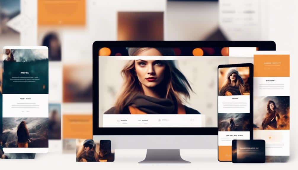
Responsive design is essential for ensuring that your emails adapt seamlessly to any screen size and device. With more and more people accessing their emails on their mobile devices, it's crucial to optimize your email layouts for mobile devices. Here are some tips to help you achieve a responsive design that will make your emails look great on any device:
- Make use of media queries to adjust the layout and styling of your emails based on the screen size. This will ensure that your emails are displayed properly and are easy to read on both large desktop screens and smaller mobile screens.
- Use a mobile-first approach when designing your emails. Start by designing for mobile devices, and then progressively enhance the layout for larger screens. This will help you prioritize the most important content and ensure a smooth user experience on mobile devices.
- Streamline the design process by using email templates. Templates not only save time but also help maintain consistent branding across your email campaigns. They provide a framework for creating responsive designs and ensure that your emails have a professional and cohesive look.
- Test your emails on different devices and screen sizes to ensure that they're displaying correctly. Regular testing will help you identify any issues and make necessary adjustments to improve the responsiveness of your emails.
Frequently Asked Questions
How Can I Optimize My Email Design for Accessibility?
To optimize your email design for accessibility, focus on inclusive design principles and improving readability. Consider using clear and concise language, appropriate color contrasts, and alt text for images.
What Are Some Common Mistakes to Avoid When Choosing Color Schemes for Emails?
When choosing color schemes for emails, common mistakes to avoid include using too many colors that clash, not considering the accessibility of the colors for visually impaired users, and forgetting to test how the colors appear on different devices.
How Can I Incorporate Interactive Elements Into My Email Design?
To incorporate interactive elements into your email design, try using GIFs and videos to bring your content to life. You can also enhance user engagement by using gamification techniques like quizzes or interactive surveys.
Are There Any Specific Font Styles or Sizes That Work Best for Mobile Devices?
To optimize your email design for mobile devices, it's important to choose font styles and sizes that enhance readability. Consider using clean, legible fonts like Arial or Helvetica, and ensure that your font sizes are responsive and easily readable on smaller screens.
What Are Some Best Practices for Using Images and Graphics in Email Design?
To make your emails visually appealing, follow these email design trends. Use responsive design to ensure images and graphics adapt to different devices. This is important for engaging your audience and providing a seamless experience.
Conclusion
Congratulations! You're now armed with the cutting-edge design tips to elevate your email aesthetics.
With carefully chosen color schemes, enhanced typography, organized layouts, and captivating images and graphics, your emails will stand out from the crowd.
And don't forget responsive design, ensuring your emails look great on any device.
So go ahead and create visually appealing and impactful emails that will captivate your audience and leave a lasting impression.
Happy designing!
