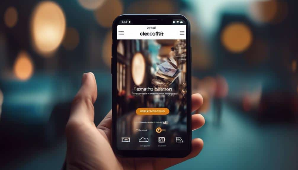
Essential Strategies for Crafting Mobile-Friendly Emails That Convert
Crafting mobile-friendly emails that convert is like navigating a bustling city street during rush hour; it requires finesse, attention to detail, and the ability to capture attention amidst the chaos.
But fear not, for in this discussion, you will discover essential strategies that will help you seamlessly navigate this digital landscape.

From optimizing your email design for mobile devices to creating compelling subject lines and call-to-action buttons, these strategies will empower you to engage your audience and drive conversions.
So, buckle up and get ready to unlock the secrets to crafting mobile-friendly emails that captivate and convert.

Key Takeaways
- Implement responsive design and mobile-friendly formatting for better engagement and conversion rates
- Optimize subject lines for mobile devices with clear and concise language and engaging call-to-action buttons
- Use visually appealing and strategically positioned call-to-action buttons to increase conversions and audience engagement
- Personalize emails and segment them based on relevant data to create a tailored experience and generate higher revenue per email
Responsive Design

Craft mobile-friendly emails that convert by implementing responsive design. Responsive design is a crucial aspect of creating emails that adapt seamlessly to different devices and screen sizes. With fluid layouts and adaptive design, your emails will look great and perform well on any device, whether it's a smartphone, tablet, or desktop computer.
By using fluid layouts, your emails will adjust their size and proportions based on the screen they're being viewed on. This means that your email will look just as good on a small mobile screen as it does on a larger desktop screen. Adaptive design takes this a step further by optimizing the email's content and layout for each specific device, ensuring an optimal user experience.
Studies have shown that responsive design can significantly improve email engagement and conversion rates. In fact, emails with responsive design have been found to have higher click-through rates and lower unsubscribe rates. By making your emails easy to read and navigate on any device, you're increasing the chances of your recipients taking the desired action.
Clear and Concise Subject Lines
When it comes to email subject lines, shorter is better. Studies show that subject lines with fewer than 50 characters have higher open rates on mobile devices.
So, keep your subject lines clear and concise, making every word count. Additionally, make sure your subject lines are mobile-friendly by optimizing them for small screens and avoiding any unnecessary formatting.
Lastly, don't forget to include an engaging call-to-action button in your email to increase click-through rates and conversions.
Short Subject Lines
Create subject lines that are short, clear, and concise to increase the likelihood of your emails being opened and read.
In today's fast-paced digital world, people's attention spans are shorter than ever. To capture their attention and encourage them to open your emails, your subject lines need to be punchy and to the point.
Here are four reasons why short subject lines are essential for email success:
- Instant Impact: Short subject lines deliver your message quickly and effectively, grabbing the reader's attention immediately.
- Mobile Optimization: With the majority of emails being opened on mobile devices, shorter subject lines are easier to read and comprehend on smaller screens.
- Increased Open Rates: Research shows that emails with shorter subject lines have higher open rates, as they create a sense of curiosity and urgency.
- Clear Expectations: By keeping your subject lines concise, you clearly communicate what the email is about, making it more likely for recipients to click and engage.
Crafting short subject lines in a conversational tone and considering email length will help you serve your audience better, ensuring your emails are opened and read.
Mobile-Friendly Formatting
To maximize the impact of your emails, ensure your subject lines are clear and concise, especially when it comes to mobile-friendly formatting. Mobile responsiveness and user-friendly design are crucial factors in email marketing success.
With the majority of people now accessing emails on their mobile devices, it's essential to optimize your email formatting for smaller screens. Long subject lines may get cut off, leading to confusion and a decrease in open rates. Keep your subject lines short and to the point, conveying the main message of your email in a few words.
Use clear and compelling language to grab the attention of your audience. By adopting mobile-friendly formatting techniques, you can improve engagement and conversions, ultimately serving your audience better.
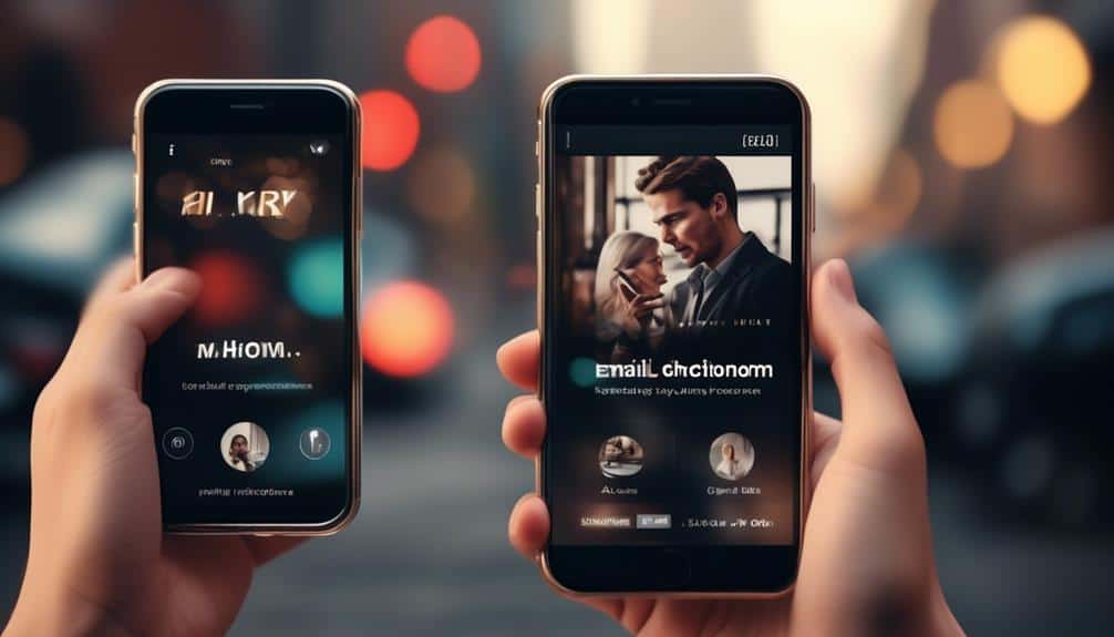
Engaging Call-To-Action Buttons
Engage your audience with clear and concise subject lines, ensuring that your call-to-action buttons are compelling and effective. To create engaging call-to-action buttons, follow these effective strategies:
- Use interactive buttons: Incorporate buttons that are visually appealing and encourage users to take action. Use contrasting colors and clear labels to make them stand out.
- Provide clear instructions: Clearly state what action you want your audience to take. Use action-oriented language that prompts immediate response, such as 'Shop now,' 'Learn more,' or 'Sign up today.'
- Place buttons strategically: Position your call-to-action buttons where they're easily visible, such as at the top of your email or after a persuasive message. Make sure they're also easily clickable on mobile devices.
- Optimize for mobile: Since a large proportion of email opens occur on mobile devices, ensure your buttons are large enough for easy tapping and properly spaced to avoid accidental clicks.
Simplified Layout and Formatting
Simplifying the layout and formatting of your mobile-friendly emails can significantly enhance readability and boost conversion rates. A simplified design and minimalistic layout are essential for creating emails that are easy to read and navigate on mobile devices.
When it comes to mobile email, simplicity is key. Mobile screens are smaller, and users are often on the go, so it's crucial to make your emails easy to digest. A cluttered and complex design can frustrate users and lead to high bounce rates.
To create a simplified layout, focus on using clean and clear typography. Choose fonts that are legible on small screens and use a font size that's easily readable. Avoid using too many different fonts and font sizes, as this can create confusion and make your email appear cluttered.
In terms of formatting, aim for a single-column layout. This layout not only makes it easier for users to scroll through your email but also ensures that your content is displayed properly on different devices and screen sizes. Use ample white space to give your email a clean and organized look.
Optimized Call-to-Action Buttons
Are your call-to-action buttons optimized for maximum conversions?
Button design techniques can greatly impact the effectiveness of your emails.
Button Design Techniques
To optimize your email's call-to-action buttons, employ button design techniques that are concise, persuasive, and data-driven. Here are four strategies to help you create effective call-to-action buttons:
- Button Placement:
Position your buttons where they're easily visible and accessible. Place them at the top of your email or in the center to catch the reader's attention immediately.
- Button Color Choices:
Select colors that stand out from the background and create contrast. Use bold and vibrant colors that evoke emotion and encourage action. Test different color combinations to find what works best for your audience.
- Button Text:
Keep your button text short and action-oriented. Use words like 'Buy Now,' 'Sign Up,' or 'Learn More' to clearly communicate what action you want the reader to take.
- Button Size:
Make sure your buttons are large enough to be easily tapped on mobile devices. A size of at least 44 pixels by 44 pixels is recommended.
Conversion-Driven CTAs
Positioning your call-to-action buttons strategically and using persuasive design techniques is crucial for driving conversions in your mobile-friendly emails.
To optimize the effectiveness of your CTAs, it's essential to implement conversion tracking and A/B testing.
Conversion tracking allows you to measure the success of your CTAs by tracking the number of clicks and conversions they generate. By analyzing this data, you can identify which CTAs are performing well and make data-driven decisions to improve the ones that are underperforming.
A/B testing, on the other hand, enables you to compare different versions of your CTAs to determine which design, wording, or placement resonates better with your audience. This iterative process helps you refine your CTAs and increase their conversion rates, ultimately driving more conversions in your mobile-friendly emails.
Mobile-Friendly Images and Graphics
Optimize your email images and graphics for mobile devices to enhance the user experience and boost conversion rates. In today's mobile-first world, it's crucial to ensure that your visuals are optimized for mobile devices. Here are four graphic design techniques for mobile devices that will help you create visually appealing and conversion-driven emails:
- Responsive Design: Use responsive design techniques to ensure that your images and graphics automatically adjust to fit different screen sizes. This will prevent any distortion or cropping of visuals, providing a seamless viewing experience for your audience.
- Minimalist Approach: Keep your visuals simple and uncluttered. Avoid using excessive text or complex graphics that may be difficult to view on smaller screens. A minimalist design won't only load faster but also make it easier for users to understand your message at a glance.
- High-Quality Images: Use high-resolution images that are optimized for mobile devices. Crisp and clear visuals will capture the attention of your audience and create a positive impression of your brand.
- Clear Calls-to-Action: Make sure your calls-to-action (CTAs) are clear, visible, and easy to tap on mobile devices. Use contrasting colors and large buttons to guide users towards the desired action, increasing the chances of conversion.
Personalization and Segmentation

Now let's explore the power of personalization and segmentation to take your mobile-friendly emails to the next level of effectiveness and engagement.
Personalization and segmentation are essential strategies that can significantly improve the impact of your email marketing campaigns. By delivering personalized content and targeted messaging, you can create a more relevant and tailored experience for your recipients.
Personalization allows you to address your audience on an individual level, making them feel seen and understood. By using their names, past purchase history, or other relevant data, you can create a sense of connection and build trust with your subscribers.
Additionally, segmented emails, which are sent to specific groups based on demographics, interests, or behavior, can help you deliver more targeted messaging. This ensures that your emails are relevant to the specific needs and interests of each segment, increasing the chances of conversion.
Data-driven studies have shown that personalized emails have higher open rates, click-through rates, and conversion rates compared to generic ones. According to a report by Experian, personalized emails can generate up to six times higher revenue per email compared to non-personalized emails.
Frequently Asked Questions
How Can I Ensure My Email Design Is Responsive on All Mobile Devices?
To ensure your email design is responsive on all mobile devices, focus on mobile optimization and responsive design. These strategies will help your emails adapt to different screen sizes, providing a better user experience and increasing conversions.
What Are Some Best Practices for Creating Clear and Concise Subject Lines for Mobile-Friendly Emails?
To create compelling subject lines for mobile-friendly emails, start by considering the font size that works best on mobile. Keep it concise and persuasive, using data-driven language. Serve your audience by crafting clear and concise subject lines that convert.
How Can I Simplify the Layout and Formatting of My Emails to Make Them More Mobile-Friendly?
To simplify your email layout and formatting for mobile screens, focus on keeping it clean and easy to read. Use single-column layouts, clear headings, and large fonts. Also, optimize images and minimize the use of unnecessary elements.
What Are Some Tips for Optimizing Call-To-Action Buttons in Mobile-Friendly Emails?
To optimize call-to-action buttons in mobile-friendly emails, focus on button placement and designing attention grabbing buttons. Place buttons where they are easily clickable and use bold colors and clear text to grab attention and drive conversions.
How Can I Ensure That the Images and Graphics in My Emails Are Mobile-Friendly and Load Quickly on Mobile Devices?
To ensure your images and graphics load quickly on mobile devices, optimize their file size and format, prioritize a mobile-first design approach, and use responsive design techniques. This will enhance user experience and increase conversions.
Conclusion
Crafting mobile-friendly emails is essential for converting leads into customers. By implementing responsive design, clear subject lines, and simplified layouts, you can effectively engage your audience and drive conversions.
Optimized call-to-action buttons, mobile-friendly images, and personalization are also important factors to consider. Studies show that mobile users are more likely to take action on emails that are easy to read and navigate on their devices.
So, make sure to prioritize mobile optimization in your email marketing strategy to maximize your conversion rates.